

NeXT Rewards
Marketing Website . Mobile App . Design Audit . Wireframes . Prototype . User testing
Revamped NeXT Rewards UX to spark engagement and boost loyalty.

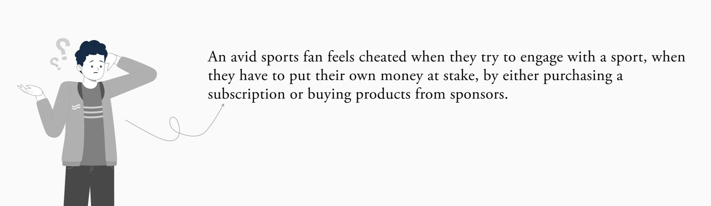
NeXT is a sports-based media platform that drives consumer behavior with reward points. It enables brands to connect directly with users. Fans predict outcomes of Pivotal Moments (PMs) during broadcasts and earn redeemable reward points sponsored by brands, for correct answers.
Client
My Role
User Experience Designer
UI designer. Design Lead, Project Owner, Business Analyst
Team
Native Mobile App | Marketing Website
Platform
6 Months (Phase 1 + Phase 2 + Marketing Website)
Duration
Problem Statement
Challenge
The client provided initial designs and brand guidelines for development-ready designs. We conducted a design audit, identifying gaps in user flow, UI inconsistencies, and accessibility issues. The challenge was to innovate within the original design guidelines while enhancing the user experience and ensuring technical feasibility
The purpose
To empower sports fans with an exciting platform that keeps them engaged and motivated throughout the game, instilling a sense of involvement. Additionally, the platform aims to increase brand visibility to fans.
The Redesign
Why was the redesign needed?
1) Several gaps in the flow were identified during the audit.
2) Inconsistencies in buttons, layout and brand color usage throughout the application.
3) Accessibility issues through out the platform.
4) As the designs were build in early 2019’s, they looked really outdated, and required a rewamp to make it more contemporary and modern.
5) New features needed to be introduced that required rework on the information architecture and user flow.
Here is a side-by-side comparison of the old and redesigned platform screens. The redesign enhances usability, creating a cleaner and more modern interface.
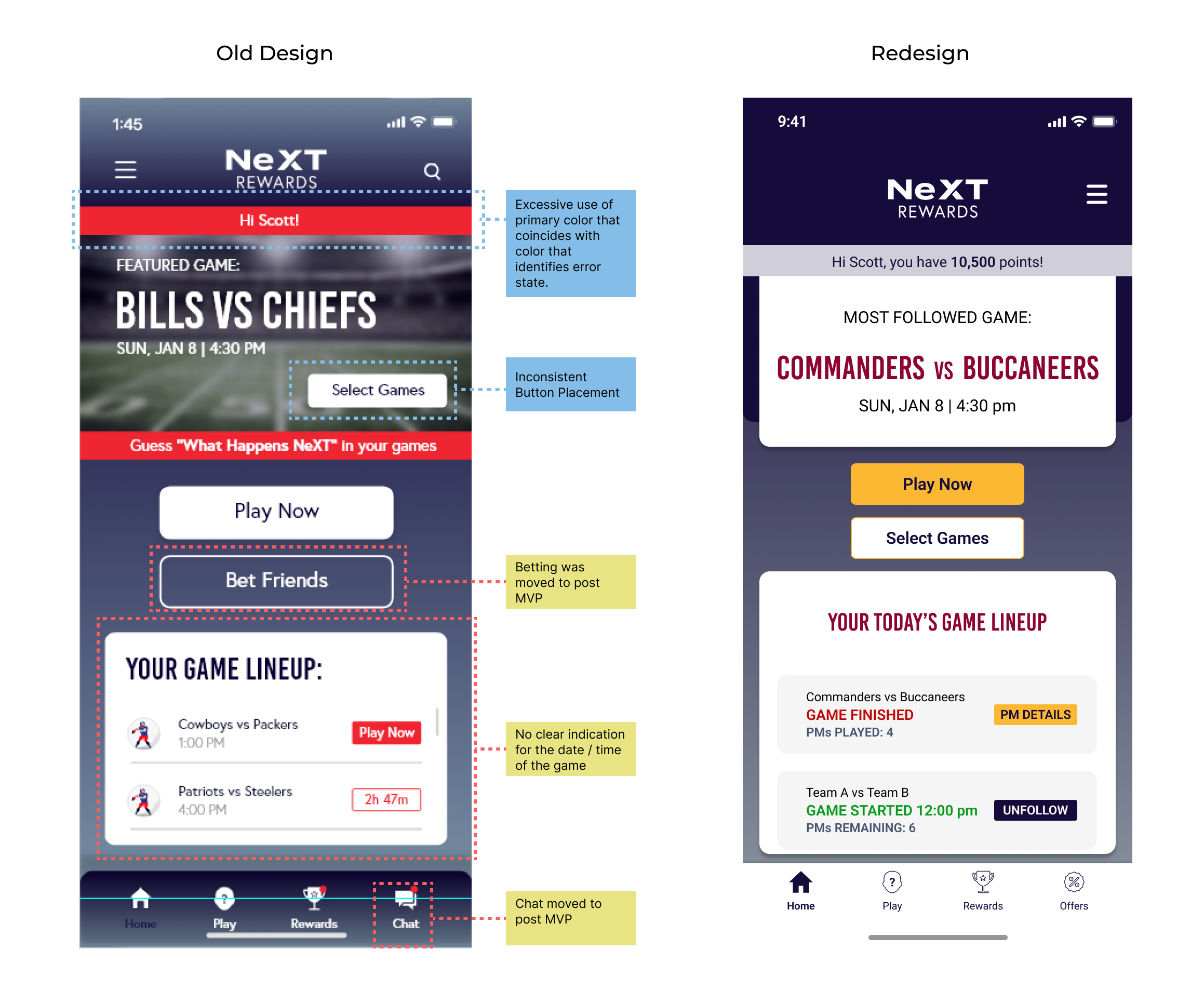
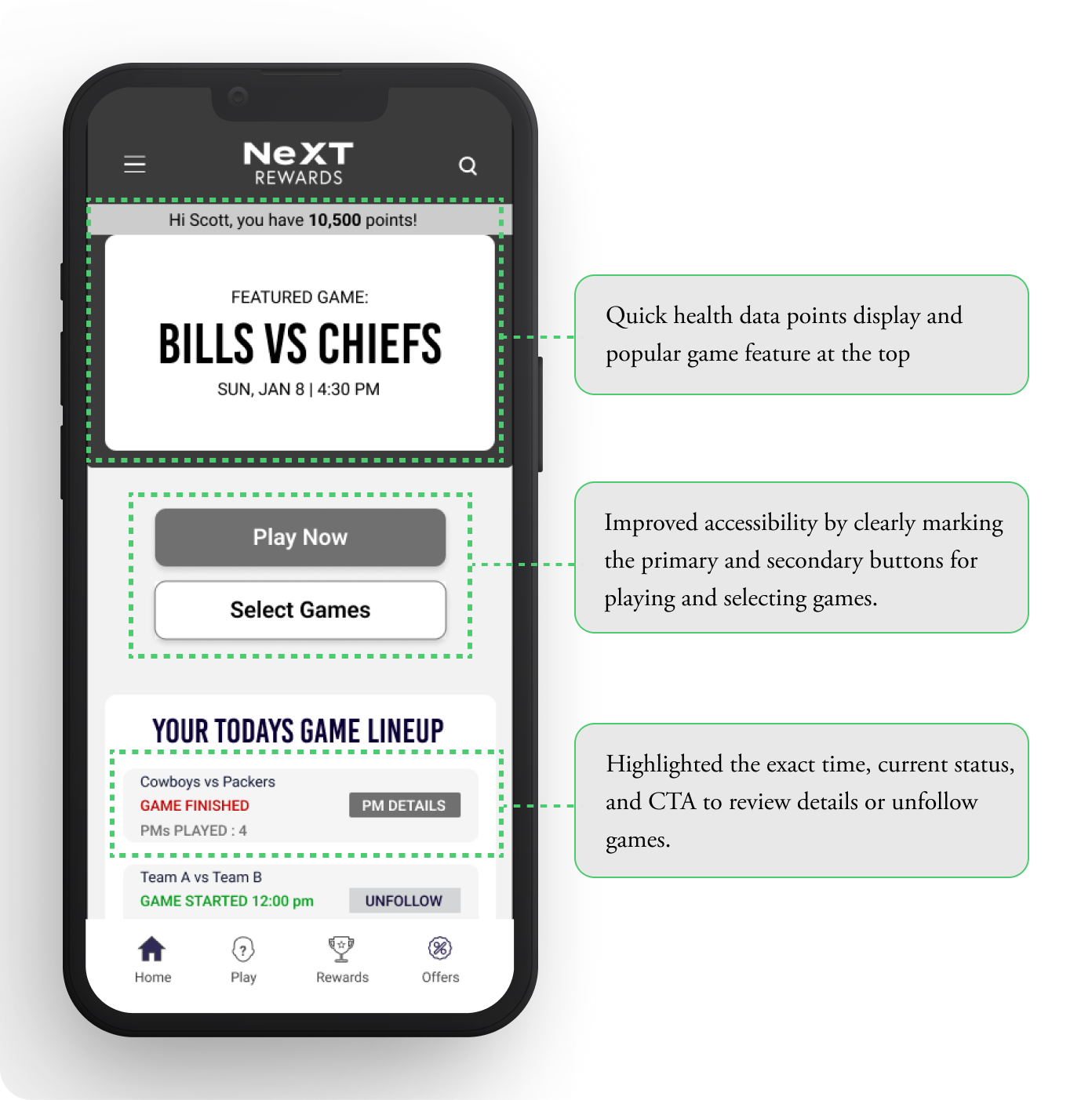
Landing screen
Refined button hierarchy for an intuitive user experience.
Added a visual time-lapse indicator to encourage timely response by players by creating a sense of urgency.
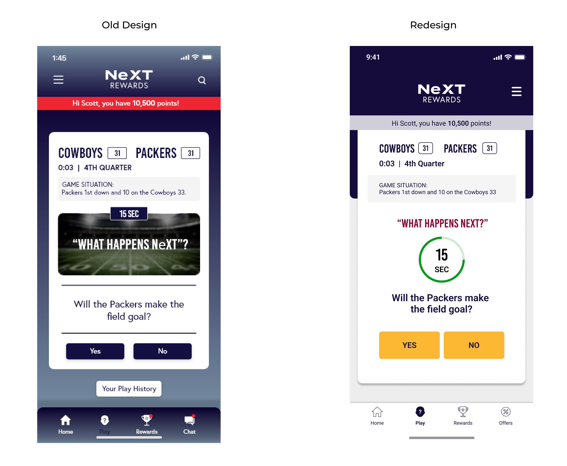
Pivotal Moment
Optimized navigation to highlight essential app features, consistent button placements, improved hierarchy.
Streamlined information for upcoming games, and a redesigned architecture.
The Design Process
1. Research | Stakeholder Interview | Discovery Workshop
In order to understand the product, we conducted a 2 hour workshop with the clients, to gather information regarding their vision, and goals. Deep dived into the user types, studied and created each persona. Identified the problem statement, painpoints and oppurtunities for the product.
User Types :
We identified four user types based on demographics, lifestyle, socioeconomic status, and financial status:
Trend Positive Fan: These passionate sports enthusiasts are deeply connected with sports groups and brand sponsorships. They actively support their teams and proudly showcase their allegiance.
Busy Fan: These fans are often busy balancing work and family life. Though they love sports, their engagement is limited by time constraints. They cherish occasional breaks from their routine to enjoy a game.
Armchair Fan: Preferring the comfort of their living rooms, these fans enjoy watching games at home with their families. They are highly influenced by targeted brand advertisements and are loyal to sponsors.
Game Expert Fan: These fans are knowledgeable about the facts, rules, statistics, and tactics of the game. They consider brand sponsorship an essential part of sports and appreciate the depth it adds to their experience.
User Persona’s


2. Design Audit
I, along with the UI designer and design lead, audited the existing designs, identifying gaps and inconsistencies. We received user stories for missing screens, for which I created mid-fi wireframes to map the flow for the audit. Throughout this process, we closely collaborated with stakeholders to validate assumptions and identify opportunities for improving the existing experience.
User flow example
3. Information Architecture
The first step after stakeholder interviews and mapping user flows from stories was to redefine the information architecture (IA) for clearer navigation. This streamlined the app's content, making it more accessible. I integrated the process flow with IA to ensure a simple, structured navigation, allowing users to effortlessly access key features before starting the wireframes.

4. UX Wireframes ( Mid Fi)
I meticulously analyzed each screen of the app to understand its logical flow, reduce cognitive load, and enhance information hierarchy and accessibility. This thorough approach ensured a seamless, intuitive user experience across the platform. During the process, I also identified missing flows and screens that needed to be integrated for a more complete and cohesive user journey.
Home screen
Pivotal Moment Detail

5. UX Screens
Key screens for the platform were designed with a cleaner interface, placing hierarchy, simplicity, and usability at the core of the design. This approach ensured that critical features were easily accessible, the content was well-organized, and users could navigate the platform effortlessly for a seamless experience.
6. Visual Identity
One of the biggest challenges we faced while redesigning the NeXT Rewards App was adhering to the existing visual language. This included strict constraints around brand colors, logos, and font styles.
We ensured that the fonts, colors, and animations were accessible and followed a consistent design system with a contemporary layout.
COLOR PALETTE

FONTS

ICONS

FINAL PRODUCT
I in collaboration with my team, strategically redesigned the core features, with a strong emphasis on user needs and a thorough analysis of competitor applications. Key features include:
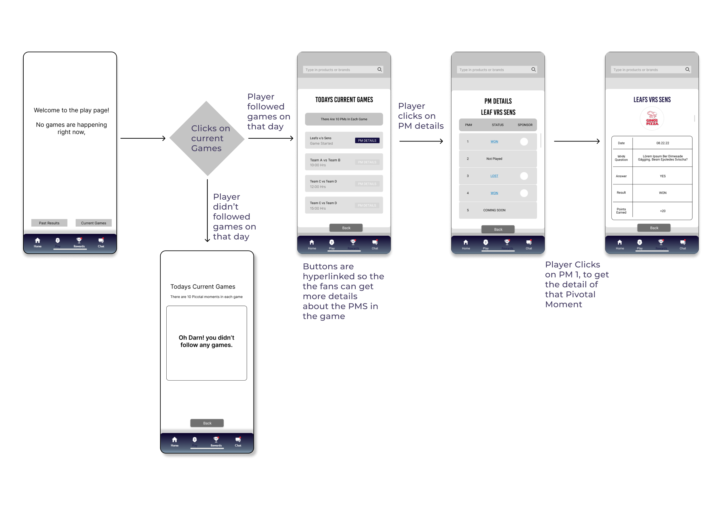
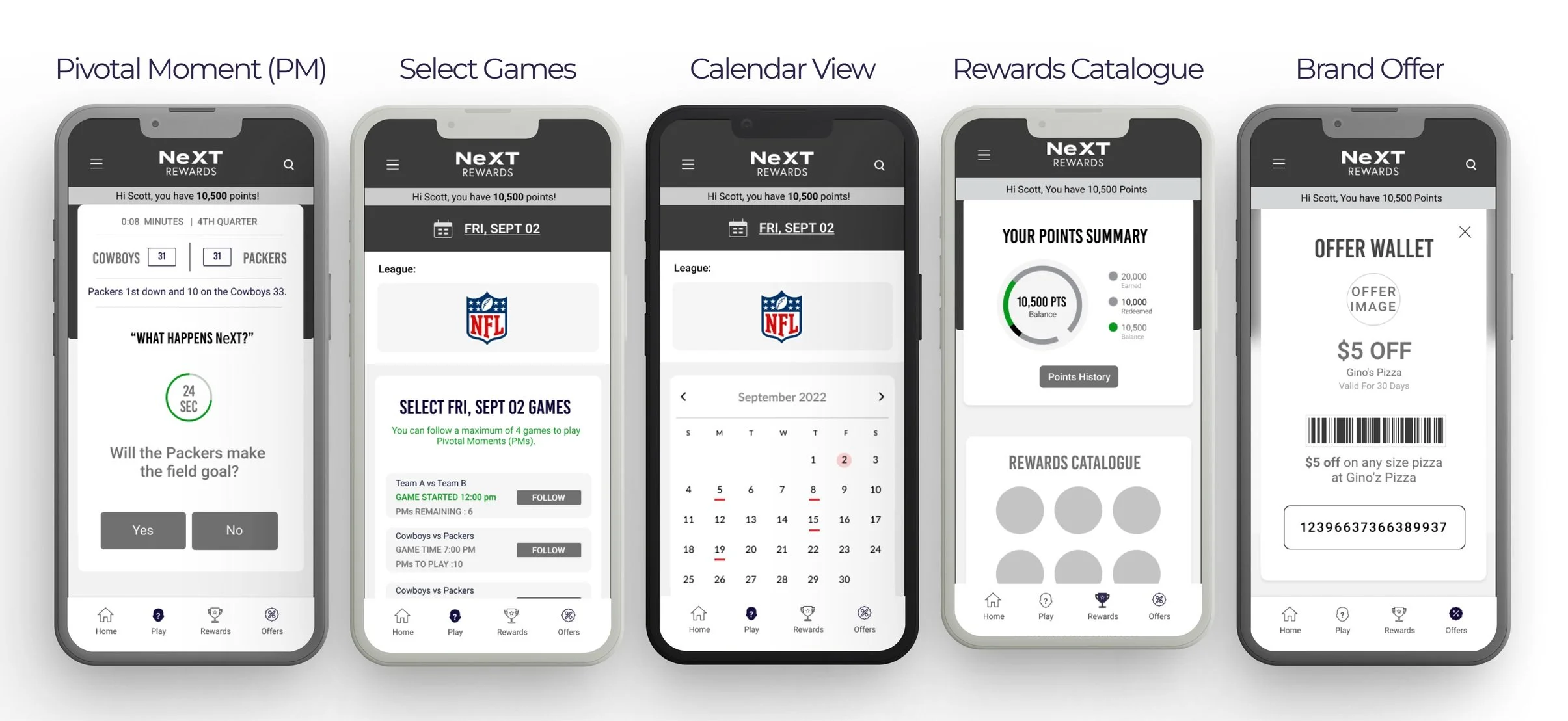
PIVOTAL MOMENT
App users receive timely push notifications or alerts whenever a new Pivotal Moment occurs in the game. In response, users must answer objective questions related to the game situation within a strict 30-second timeframe. To assist in making informed decisions, users are provided with context-specific game scenarios. Correct answers earn users bonus points, which can be redeemed for various offers. Importantly, there are no penalties for incorrect answers, promoting a supportive and engaging user experience.

2. SELECT GAMES
The home page features two main CTAs:
Play Now: Activates when a Pivotal Moment (PM) occurs.
Select Games: Allows users to choose games to follow each day across different leagues.
The page also highlights the most-followed game, determined by an algorithm, and provides a quick view of all upcoming games for the day. Users can select up to four games daily, with up to 10 PMs per game.
The game cards on the "Select Games" screen are designed to provide essential information, including team matchups, game date and time, and the number of PMs per game—helping users make informed decisions. Additionally, the calendar feature allows users to plan their selections across upcoming dates for the entire league.

3. Redeem offers
The home page features two main CTAs:
Play Now: Activates when a Pivotal Moment (PM) occurs.
Select Games: Allows users to choose games to follow each day across different leagues.
The page also highlights the most-followed game, determined by an algorithm, and provides a quick view of all upcoming games for the day. Users can select up to four games daily, with up to 10 PMs per game.
The game cards on the "Select Games" screen are designed to provide essential information, including team matchups, game date and time, and the number of PMs per game—helping users make informed decisions. Additionally, the calendar feature allows users to plan their selections across upcoming dates for the entire league.
