RISE: Health Care Social Media Platform
Mobile App . Wireframes . Dev Handoff
Conceptualized and designed Healthcare social media platform that caters to peer driven community.
First lifestyle medicine social health platform that curates a connected, personalized health experience inside a peer- driven community.
It takes an infotainment approach, Docu-series featuring 15 cast members, that teaches, equips, and inspires users through each step.
Client
Project
My Role
Team
Platform
Duration
Bennett Ranville & Bdeir
Rise Mobile App
User Experience Designer
UI Designer, Design Lead, Project Owner
Native Mobile App
20 Weeks
Problem Statement
“Healthcare employees often feel stressed and overwhelmed when managing their own lifestyle, diet, and health due to limited knowledge and experience. They need guidance and support throughout their journey to better understand and improve their health.”
Challenge
The client approached us with initial concept screens for a social media platform focused on delivering tiered educational video lessons, personalized through an onboarding algorithm based on a "diet ID" configuration that matches users with peers and cast members. While the client had a clear vision for the UI, the product features and roadmap were still undecided.
Our challenge was to refine this concept into a seamless and engaging user experience, prioritizing key features for the MVP, finalizing the app’s flow, and creating a space where users not only learn through a docuseries-style infotainment approach but also feel like active participants in the narrative. We ensured personalized content delivery, meaningful peer interactions, and a platform that fosters both education and community connection.
Project’s Objective
To create a personalized health journey by blending education and community, the app empowers users to take control of their well-being. We designed and developed a hybrid mobile app with an integrated admin panel, focusing on personalization and user engagement.
Key areas included gamification to boost motivation, infotainment to balance education with entertainment, social media-inspired scrolling for user familiarity, and integration with diet IDs to offer tailored nutritional advice. By fostering connection through peer support, the app makes health transformation a shared and motivating experience.
Project’s Outcome
Rise platform released Beta Version mid June, for Cast members and MVP launch for limited users on 23rd September. Key results achieved:
Number of downloads in Beta : 12 users
Total Downloads as of 1st oct - 500+
Significant rise in user interaction on the App, with regular engagement with content & community discussions.
Reduction in healthcare utilization rates as user’s adopt healthier lifestyle, potentially leading to significant cost saving for Corewell Health.
User Types
The client, including the Chief Marketing Officer, Design Director, and Senior Product Manager, conducted several discovery sessions with our internal design and product teams to translate their vision and explain the platform's functionality. Additionally, we performed secondary research to understand the workings of social media platforms, the algorithms behind content matching, and collaborated with a third party for an initial assessment to ensure alignment with the platform's goals
3 Main User types were identified from our stakeholders interviews, categorized in 2 categories-
App Users
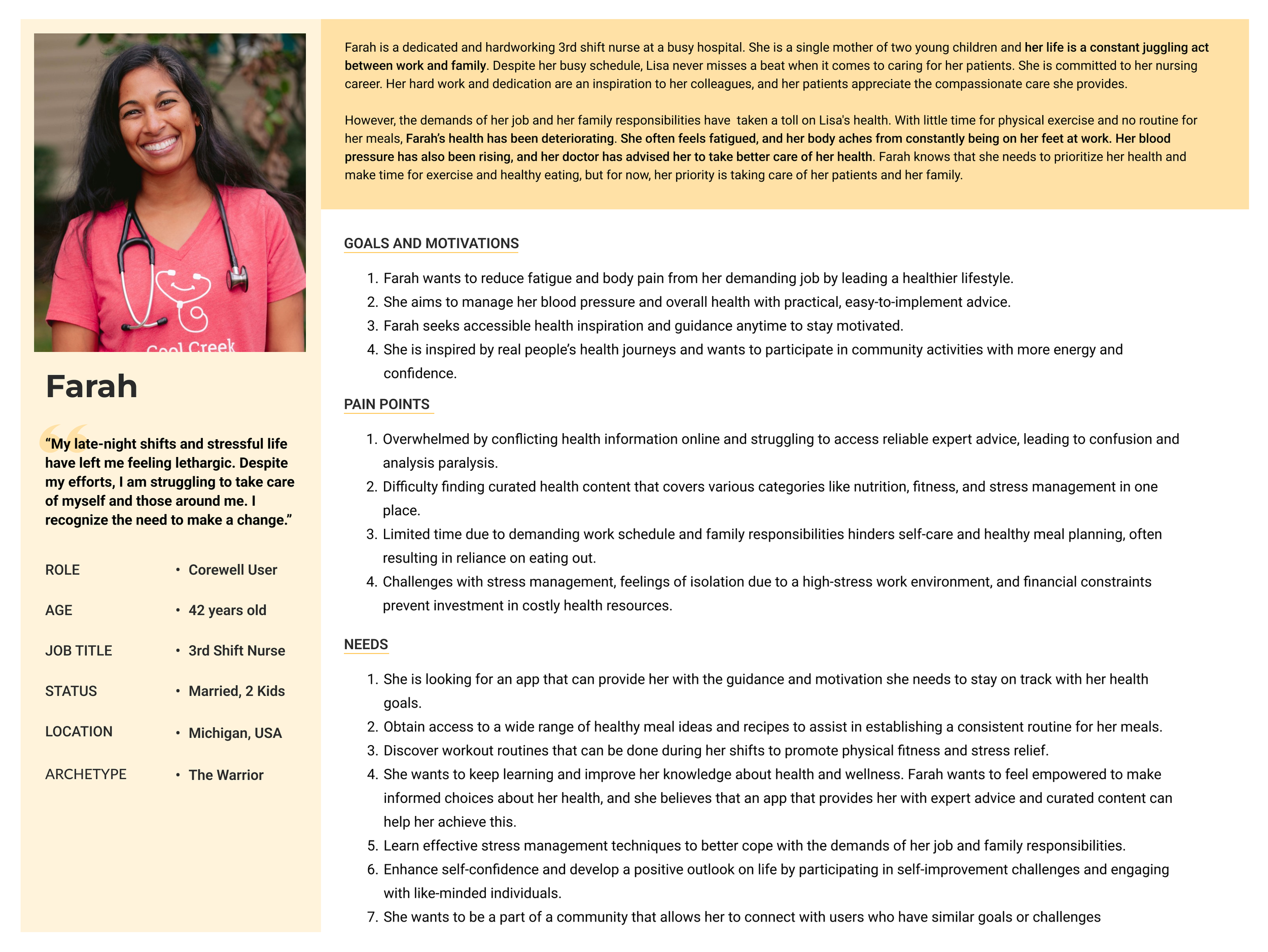
Corewell user : Healthcare practitioners from the Corewell Health Group were the first identified adopters of the Rise Mobile app. Corewell Health operates an insurance company called Priority Health, which provides coverage for 160,000 individuals and allocates $900 million annually to Corewell to manage healthcare services for this population.
These practitioners, who dedicate their time to caring for patients, often neglect their own health and dietary needs due to time constraints and lack of motivation, making them an ideal target audience for the app's personalized health journey and supportive community features..
Cast Member : Regular volunteers, motivated to improve their own health and lifestyle while also inspiring their peers by demonstrating their journey and progress. Through their active participation, they lead by example, fostering a supportive community of shared growth and transformation.
Admin User
Healthcare Experts : Health experts from the industry, with credibility, experience, and specialization in various lifestyle medicine sectors, are there to guide, educate, and support community members in achieving their target health goals. Their expertise ensures personalized, evidence-based insights that help users navigate their wellness journeys effectively.
Corewell User
Cast Member
Healthcare expert
UX Wireframes
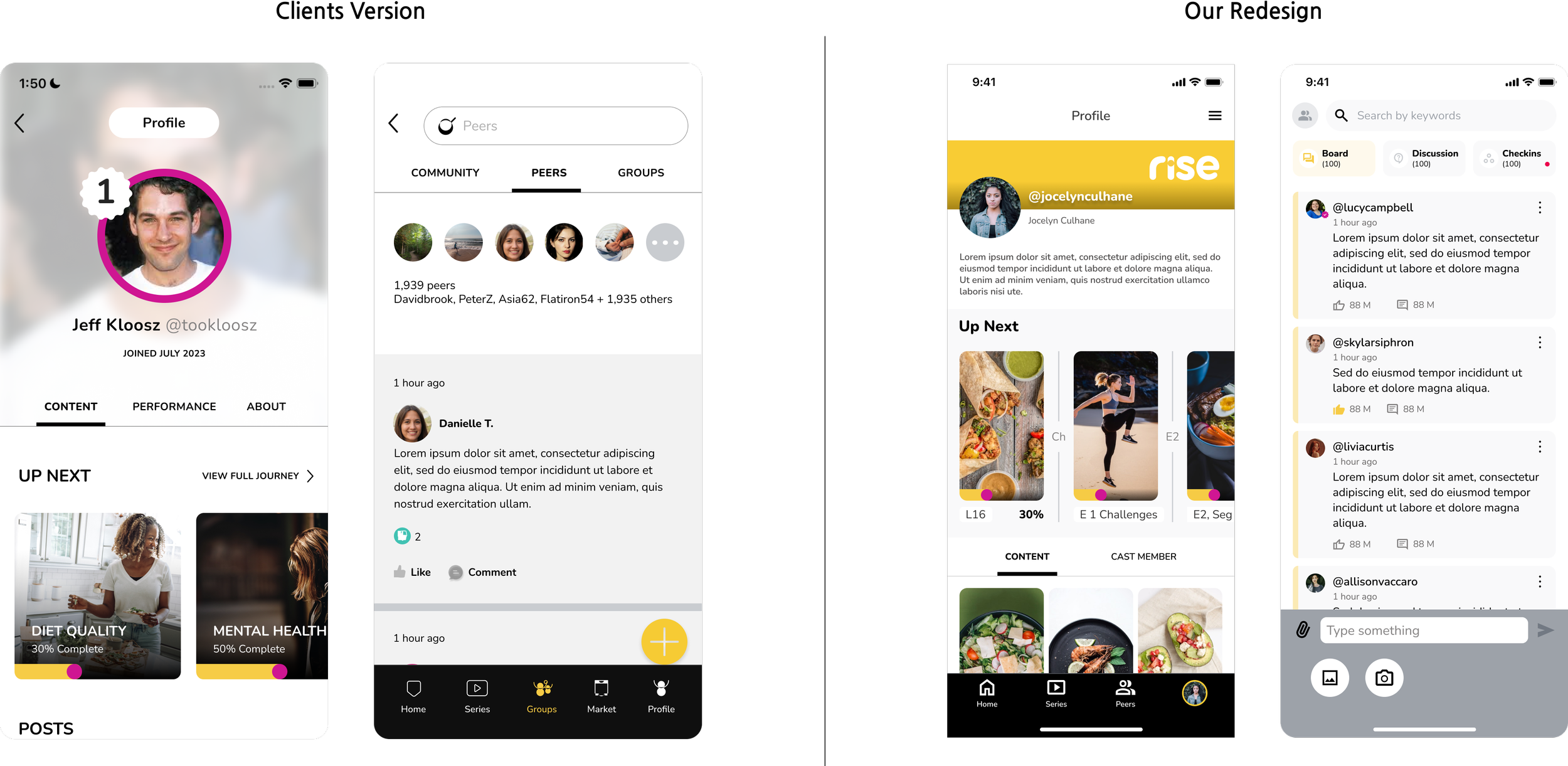
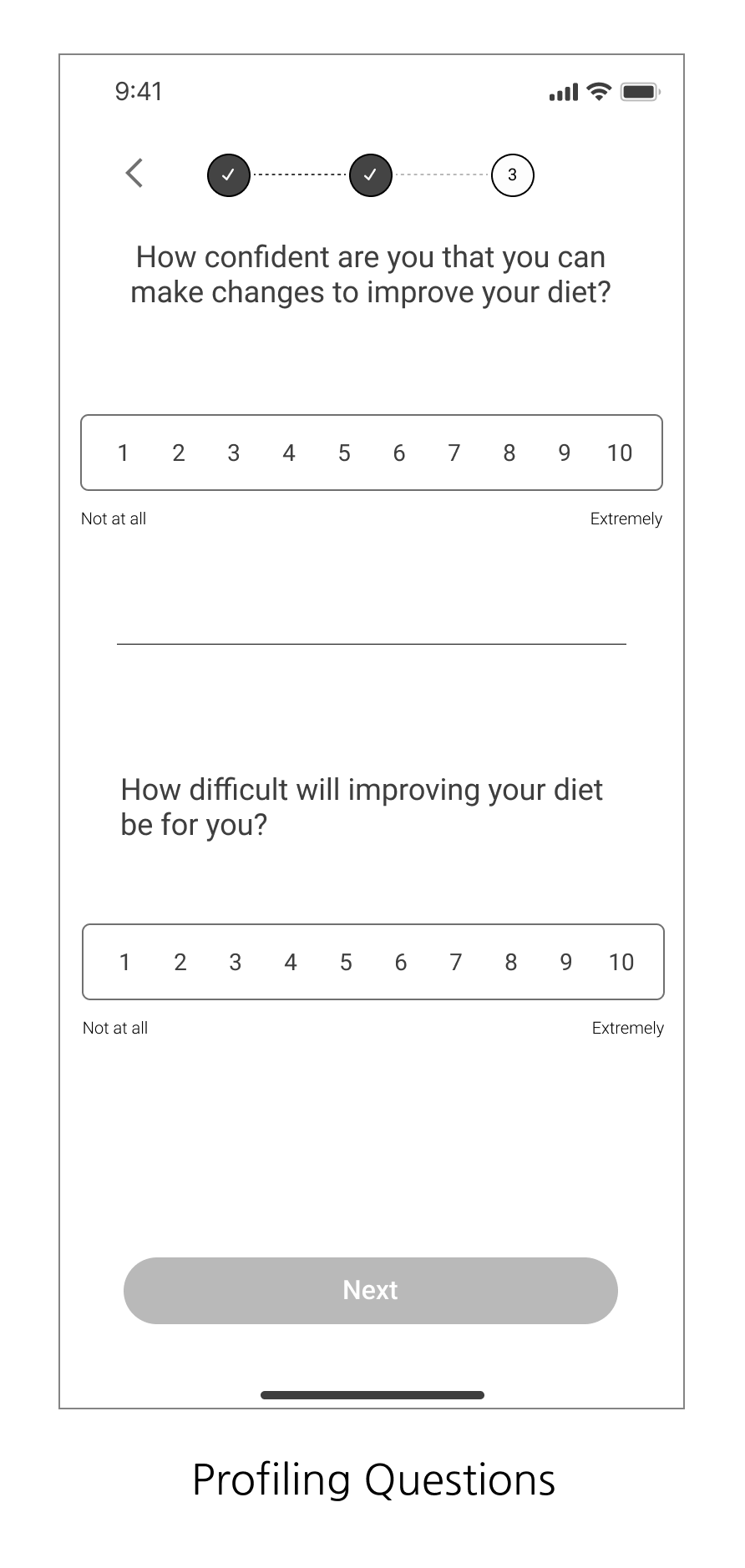
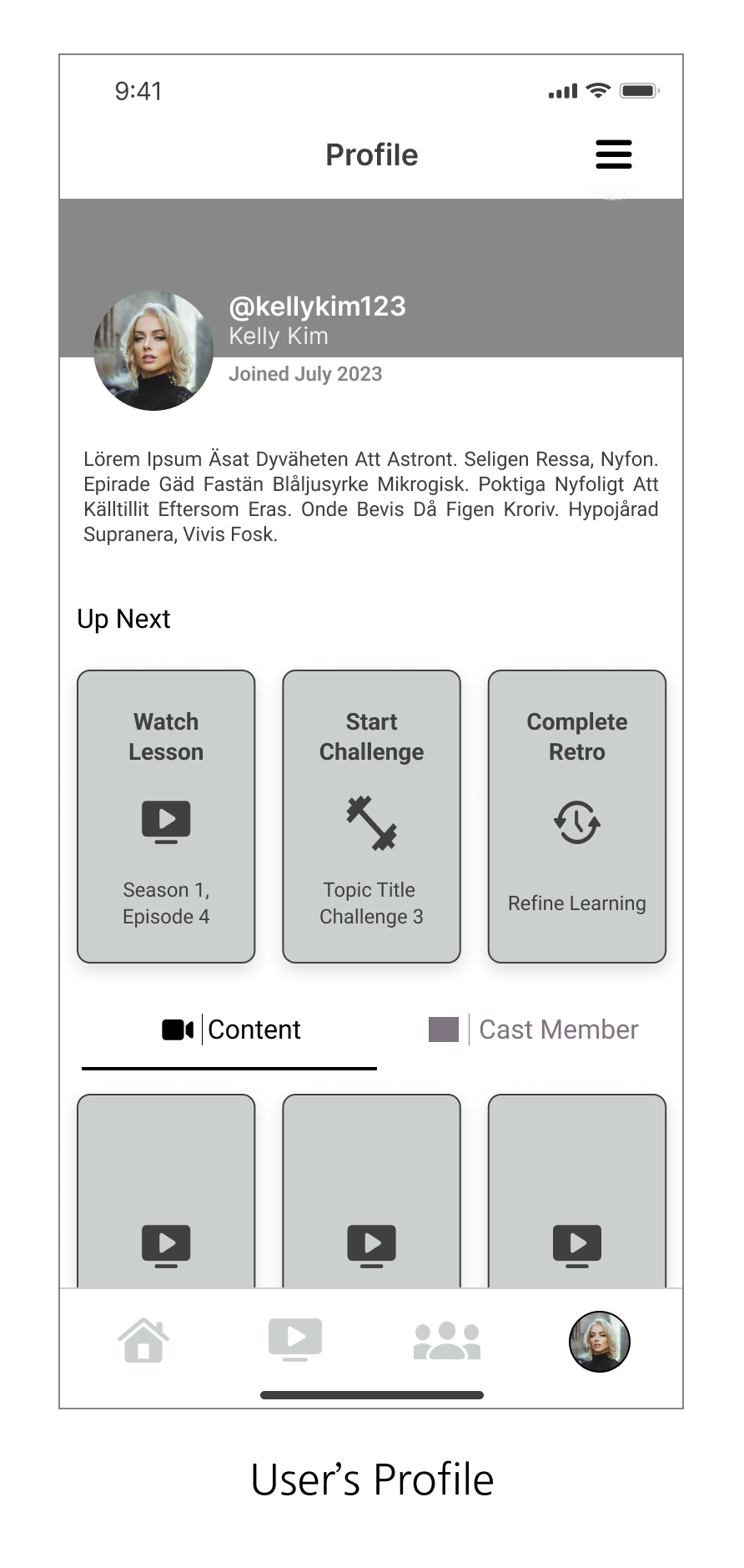
Key screens for the platform were designed with a cleaner interface, placing hierarchy, simplicity, and usability at the core of the design. This approach ensured that critical features were easily accessible, the content was well-organized, and users could navigate the platform effortlessly for a seamless experience.





Design Challenge
One of the main challenges we encountered with this project was justifying the visual language changes we proposed, as the client had already established brand guidelines and a basic design language. Together with the UI designer, I had to attend several meetings with the client to explain the rationale behind our changes. Our goal was to create a seamless user experience while maintaining the brand's aesthetic and optimizing the application's real estate. We designed the elements with accessibility in mind, given that the target user group was between the ages of 45-60.
Design System
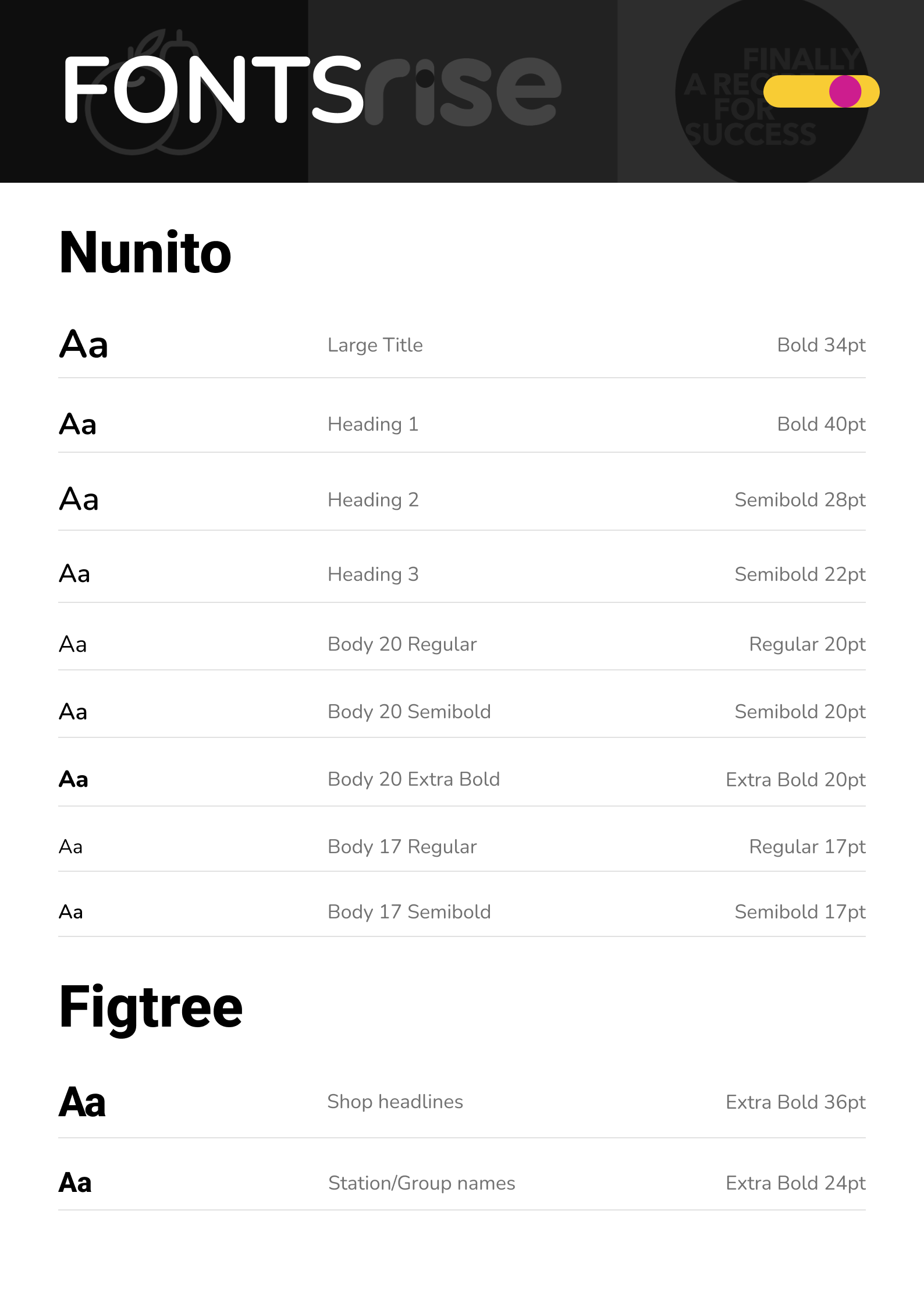
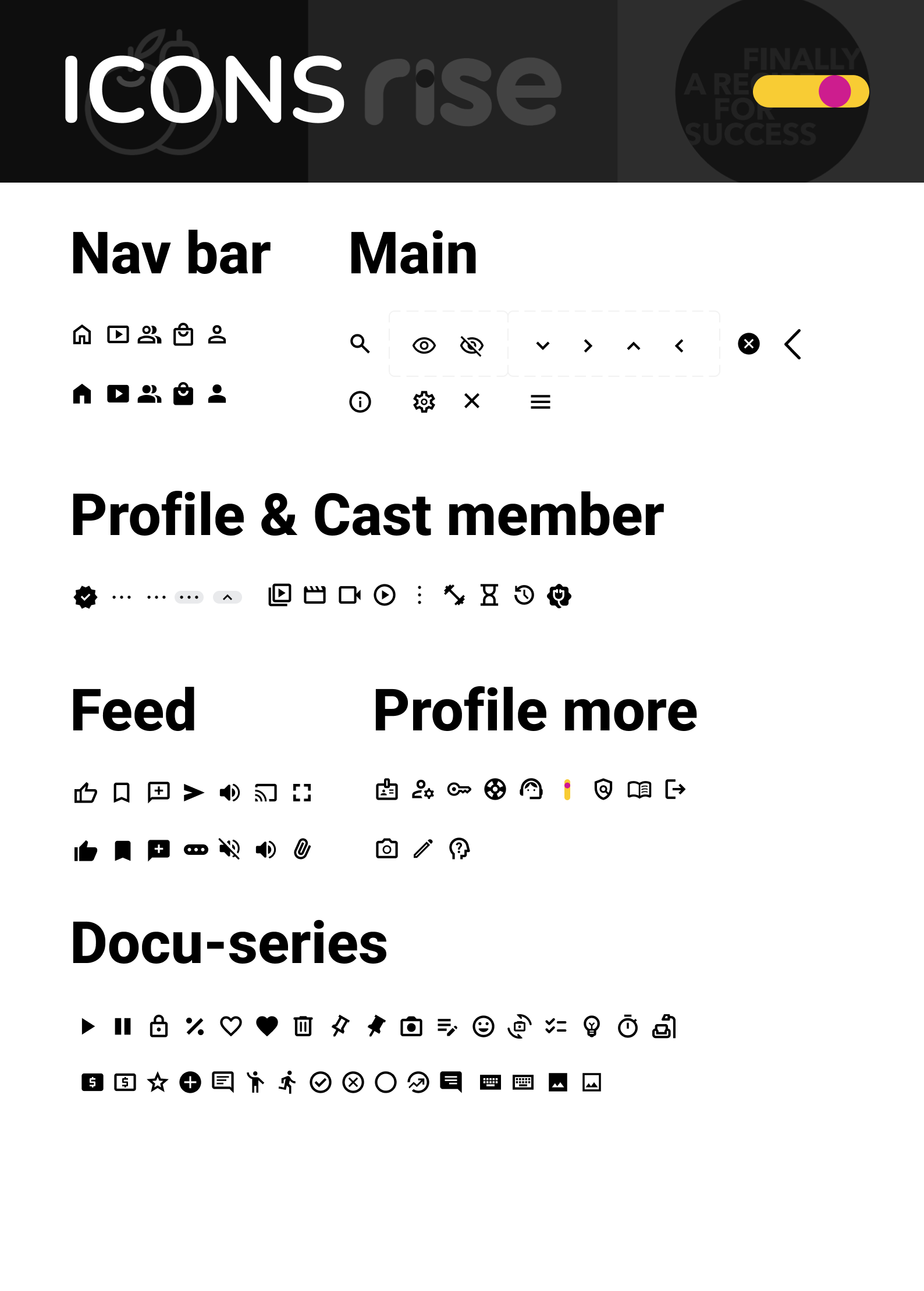
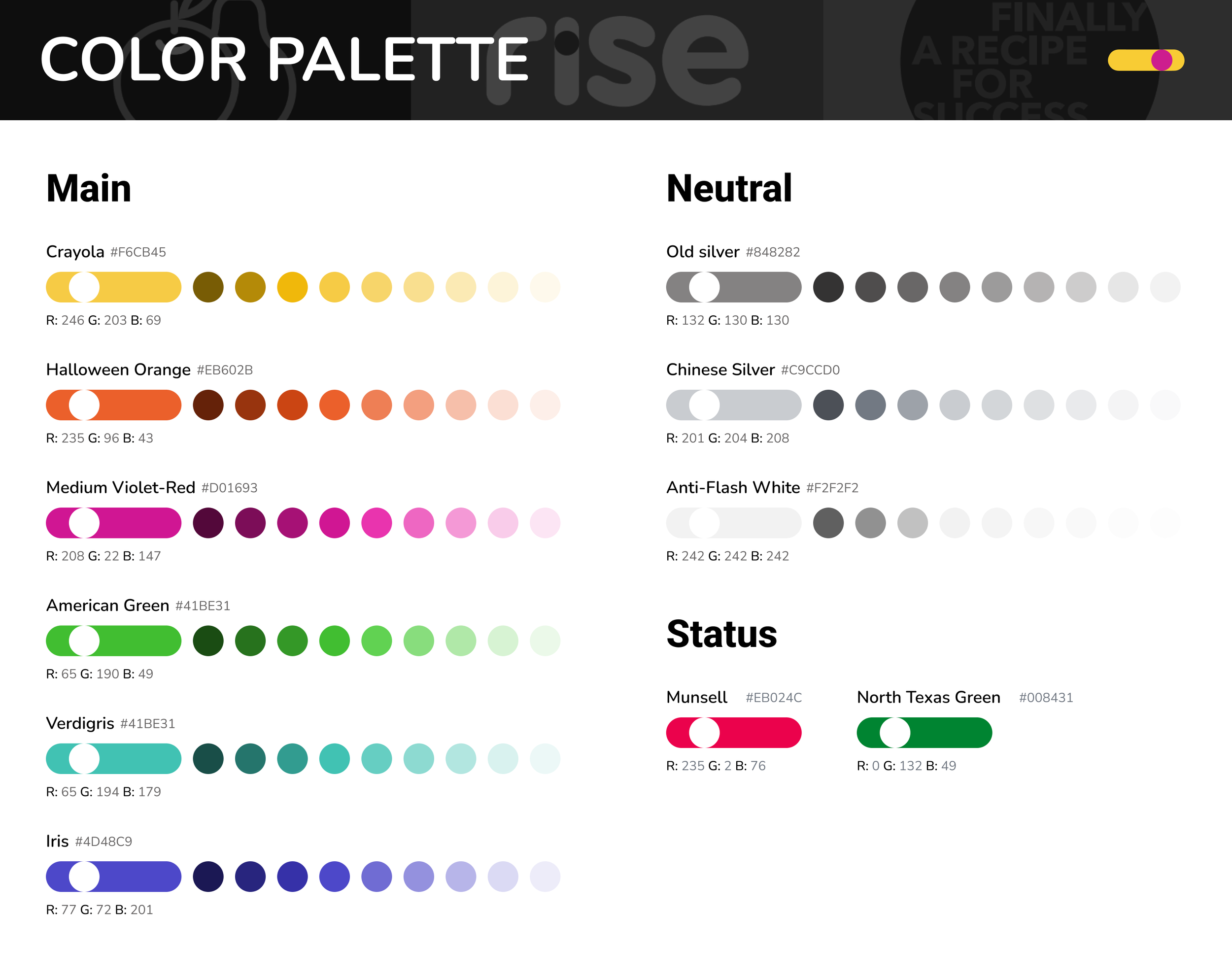
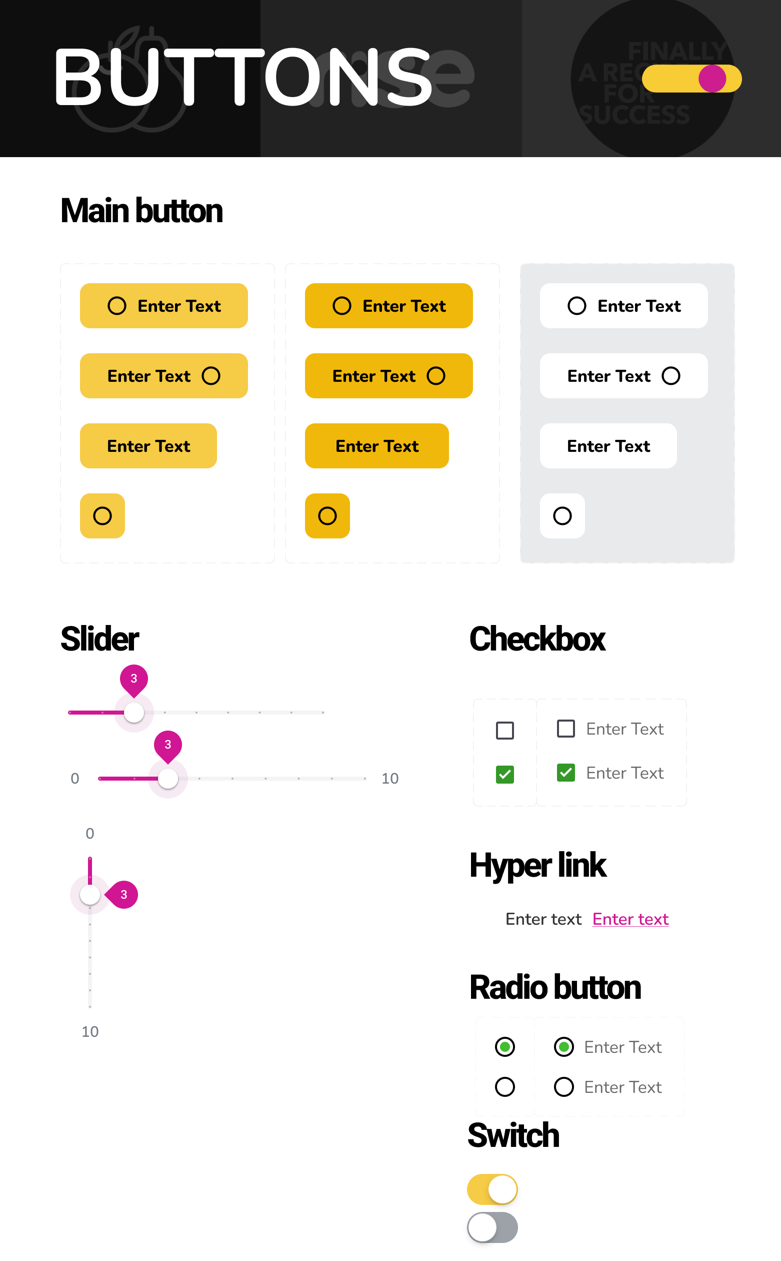
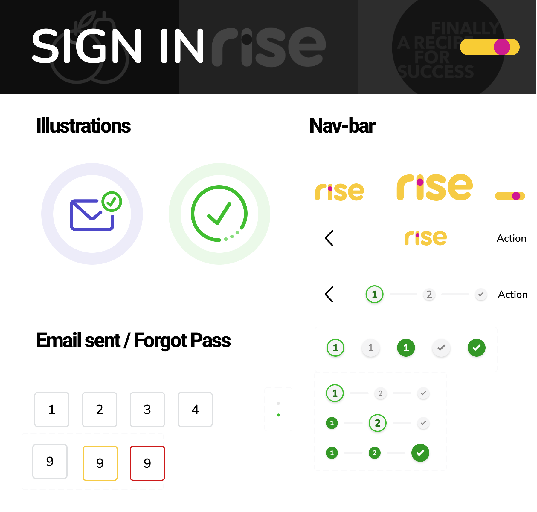
To achieve design consistency across the Mobile App within a tight timeframe, the UI designer leveraged the Material Design system. This pre-built library provided a foundation of reusable components like navigation drawers, toggles, and buttons, which we then customized to align with Rise's unique brand guidelines. This approach not only ensured a cohesive user experience but also accelerated the development process.
FINAL PRODUCT- Key Features
DIET ID Integration
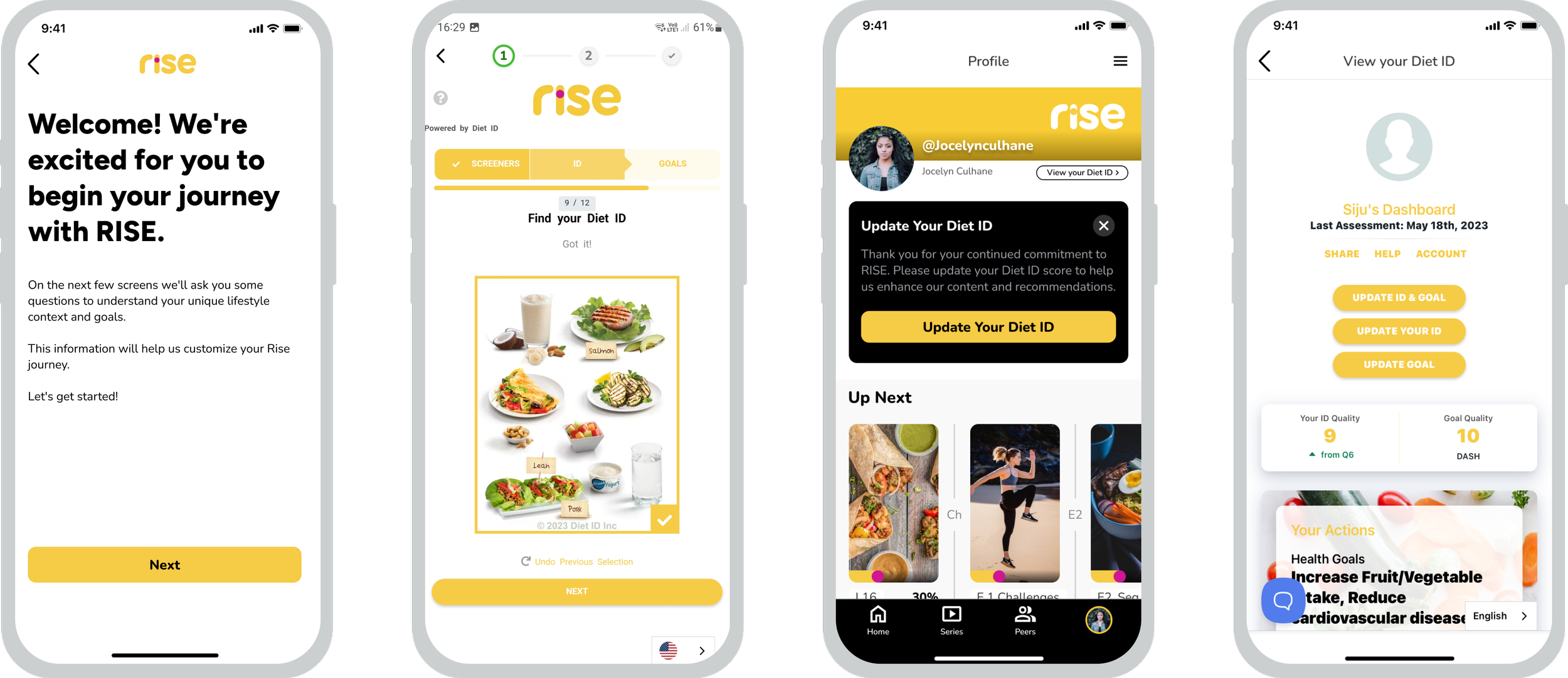
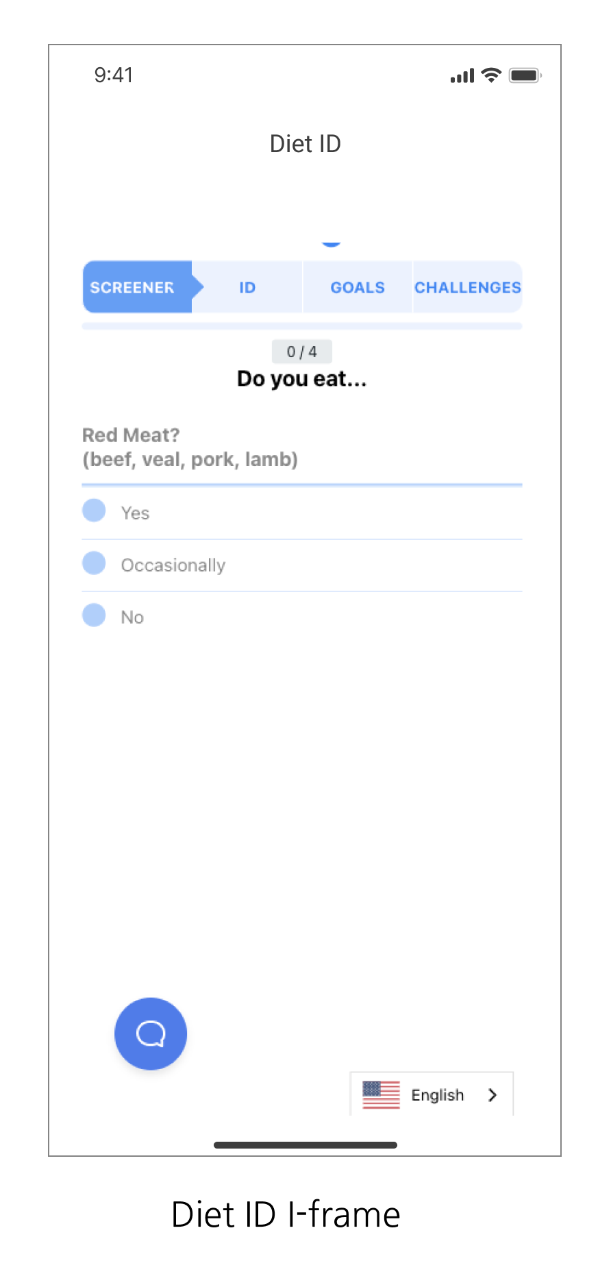
The app’s onboarding process features a visual dietary assessment through Diet ID, offering users a health overview and personalized recommendations. This provides an overall health assessment and personalized recommendations, tailoring the user experience with algorithm-driven suggestions.
The users are prompted to reassess their score at 6 and 12-week intervals for continuous updates.
Onboarding: We integrated Diet ID within an I-frame, maintaining a consistent visual language throughout the onboarding process. Additionally, we worked closely with the Diet ID team to streamline necessary steps, aiming to shorten the onboarding duration and reduce the platform's drop-off rate.
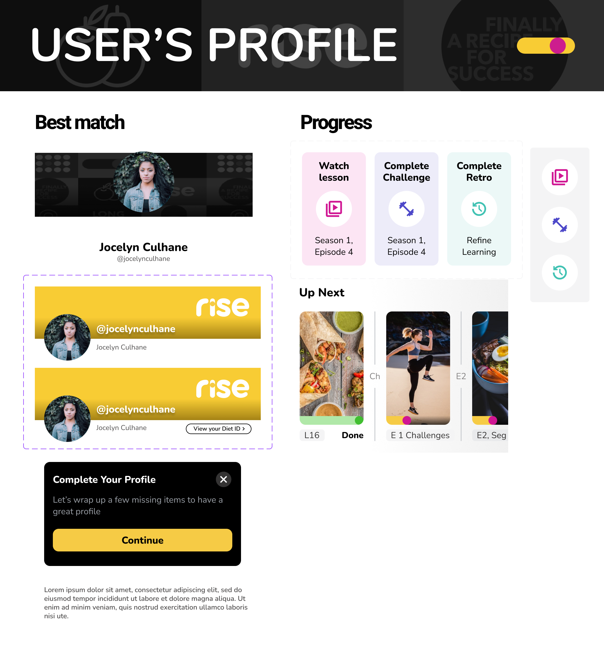
Diet ID Reassessment: We implemented reassessment pop-ups on users' profile screens and push notifications to encourage users to reassess their Diet ID at multiple intervals. This strategy provides timely reminders while preserving the logical flow of the platform.
2. Follow Cast Member
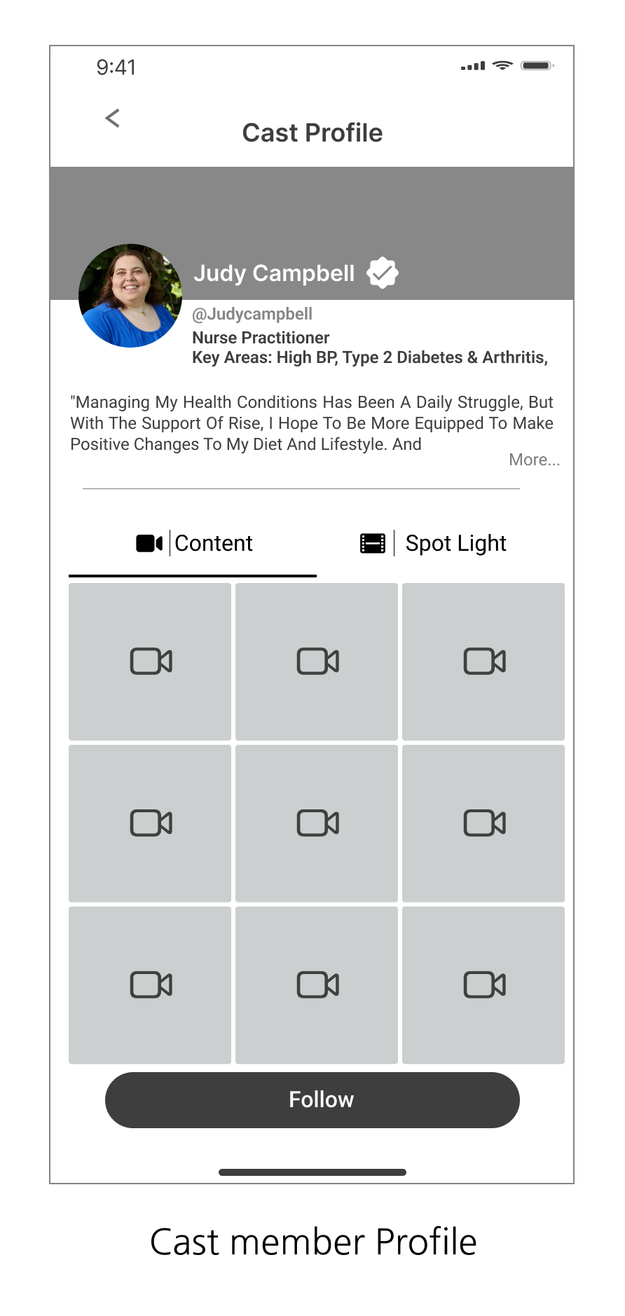
Cast members are the star of the Rise platform, they volunteer to display their personal health journey through lessons and videos to inspire others who are willing to improve their own lifestyle.
The design of these screens centers around personalization, clarity, and engagement to support users in finding cast members whose health journeys align with their own.
Core Features and Design Decisions:
Personalized Selection Process:
Tailored cast member matches are presented based on the user’s Diet ID assessment. Key details, such as name, profession, and health conditions, are shown with clear CTAs, creating a seamless, personalized experience for users to engage with relevant profiles.Clarity in Information and Actions:
A strong information hierarchy ensures easy navigation. Concise, readable tiles display essential details. The match percentage provides a quick, visual indicator of how closely the cast member's journey aligns with the user’s health profile, while the pink checkmark differentiates verified cast members, instilling trust and confidence.User Feedback and Confirmation:
Users receive instant feedback with a visual checkmark upon following a cast member. This quick confirmation keeps users engaged and reinforces their journey within the app, ensuring smooth interaction throughout.
3. DOCUSERIES
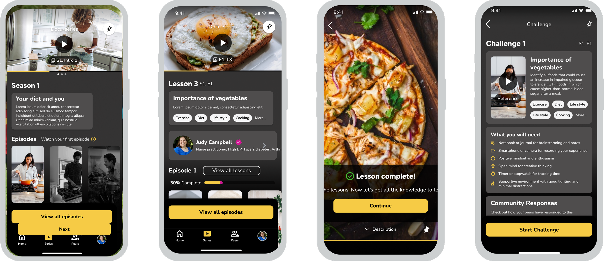
The docu-series explores health topics through engaging, bite-sized episodes, each offering valuable lessons and interactive challenges. These help users gain a deeper understanding of various health issues and practical steps toward better living. Each episode is curated by health experts and cast members, providing insights from diverse perspectives.
"Designing the Docu-series feature was incredibly exciting considering it had a complex workflow. It demanded multiple brainstorming sessions to carefully consider the layers of information and the hierarchy in which data would be consumed."
The Workflow
User flow for the docuseries feature required a comprehensive approach, given the complexity of the multiple conditions, constraints, and barriers in place to ensure smooth user progression. Our primary goal was to create an intuitive, seamless navigation system that not only minimizes cognitive load but also aligns with the ease and comfort users experience on competitive media platforms.
The core functionalities of the docuseries feature include:
Multi-Season Support: Users can access multiple seasons, with each season containing up to 20 episodes.
Episode Structure: Each episode is broken down into bite-sized video segments that must be viewed sequentially, ensuring content is consumed in a logical order.
Lesson Sequence: Episodes contain 15-30 lessons, all of which must be completed in sequence to unlock the next lesson. This structure ensures user engagement and mastery of the material.
Supplementary Content: Some lessons include additional content, such as video contributions from cast members, adding depth to the learning experience.
Interactive Challenges: Users can participate in challenges related to the lessons at any point. Once their entries are approved by an admin, they are posted to a public feed.
Progress-Based Unlocking: Upon completing 50% of the lessons in an episode, the next episode is unlocked, providing users with a sense of progression while removing unnecessary barriers.
This design approach ensures an engaging and structured experience for users while offering flexibility and additional content to keep them invested.
4. Peer Discussions
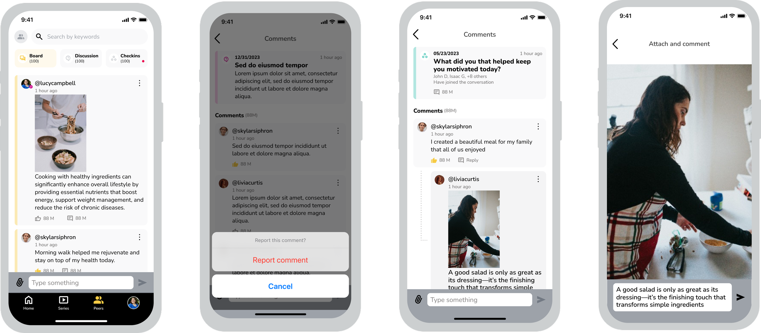
This feature promotes engagement among users by allowing them to interact, participate in discussions, and update their health status through check-ins on the peer discussion board. Users have the freedom to provide feedback, share photos and videos, and report comments as needed.
The platform is crafted to encourage continuous communication and support among individuals with similar health and lifestyle goals. Admin-curated peer groups facilitate meaningful conversations around shared challenges, enhancing the relevance and impact of these interactions.
Core Features and Design Decisions:
Minimalist Design with Light Color Palette
This design choice was made to simplify navigation and reduce cognitive load. By creating a clean interface, users can easily focus on content without distractions, enhancing their overall experience.Interactive Comment Section
Encouraging reactions and comments was essential for fostering motivation among authors and promoting interaction among peers. This decision aims to strengthen the community bond and increase user engagement, creating a more vibrant platform.Separate Tabs for Boards, Discussions, and Peers
The introduction of distinct tabs allows for seamless navigation between different areas of the platform. Clear notifications for new activity help users stay informed and engaged, promoting a sense of belonging and community involvement.User Freedom and Moderation
Implementing a reporting feature reflects a commitment to maintaining a positive and respectful community atmosphere. This decision is crucial for enhancing user retention, as it ensures that the platform remains a safe and supportive space for interactions..
Development Handoff & Reviews
The development handoff for our project was done via Figma Dev Mode, ensuring a smooth and efficient transition of the design to the developers. The process followed a sprint-based approach where we worked closely with the development team, ensuring clear communication and proper documentation to avoid any misalignment.
Here's an overview of the key steps and considerations:
Collaborative Walkthroughs: For each sprint, we held walkthroughs with developers to explain the design and address any questions, ensuring clear communication and a shared understanding.
File Hygiene & Organization:
We maintained a clean, well-structured Figma file with properly named layers and components.
The file was divided into sprint-based sections, with flows and components color-coded to simplify navigation and promote focus.
Each version was saved and labeled for clarity, ensuring developers had the latest design
Detailed Annotations:
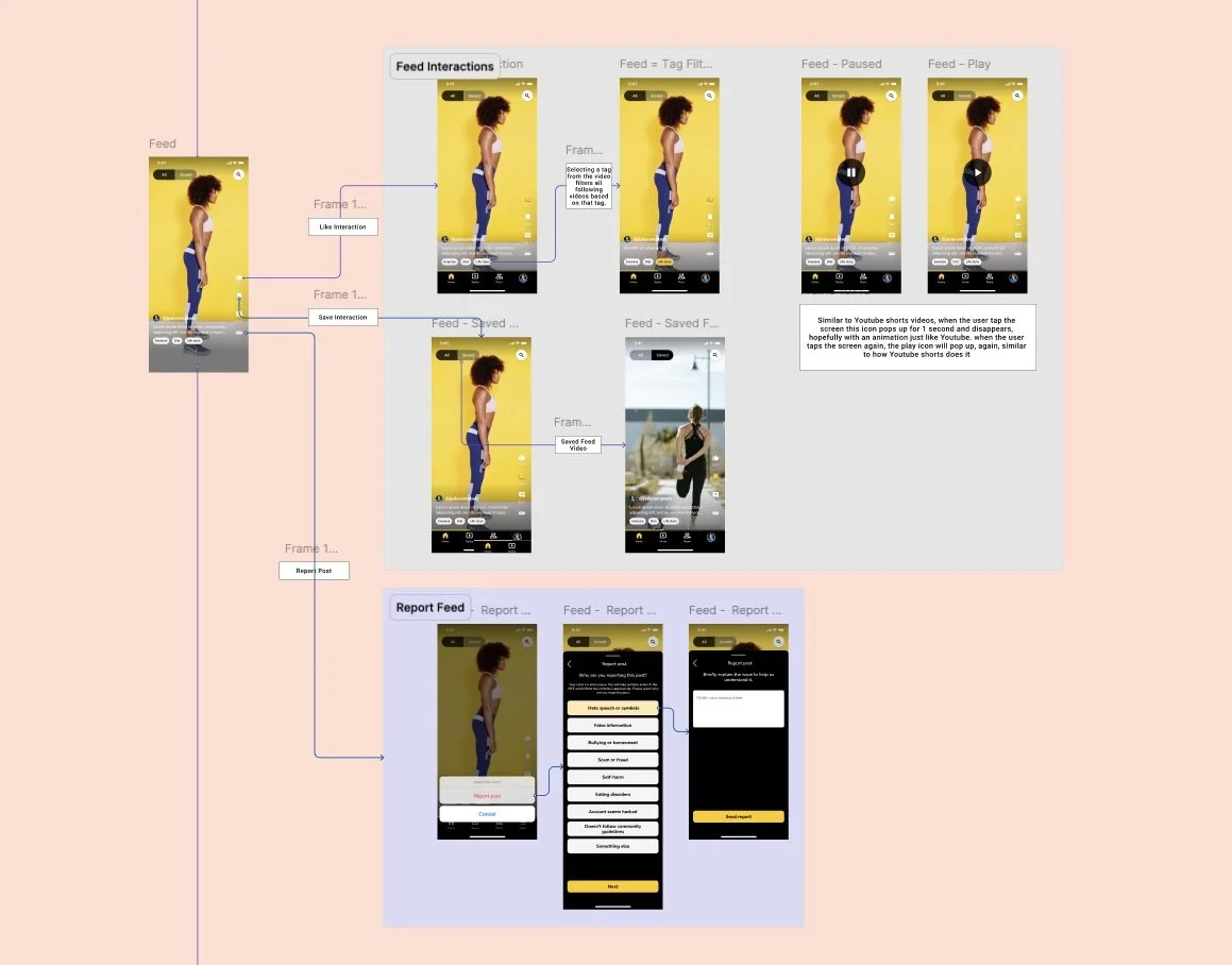
Specific interactions (hover, selected, swipe) were annotated to provide developers with clear guidance on various user behaviors and conditions.
Screen Linking with Figma Autoflow:
Screens were linked to show navigation and interactions, helping developers understand the app’s flow and facilitating quick prototyping.
Demo Sessions & Feedback:
We attended developer-led demos to ensure design consistency, providing feedback on any visual or experiential discrepancies to refine the final product.
This structured approach ensured a smooth and efficient handoff, with design intent accurately translated into the development process.


